Story Swag

Designing the Upgrade Moment

↑50%

Increase in trial subscriptions after 2 days.

role

Product Designer

Scope

Conversion optimization, feature redesign, motion and visual design

business goal

Increase trial conversions with minimal engineering lift

Summary

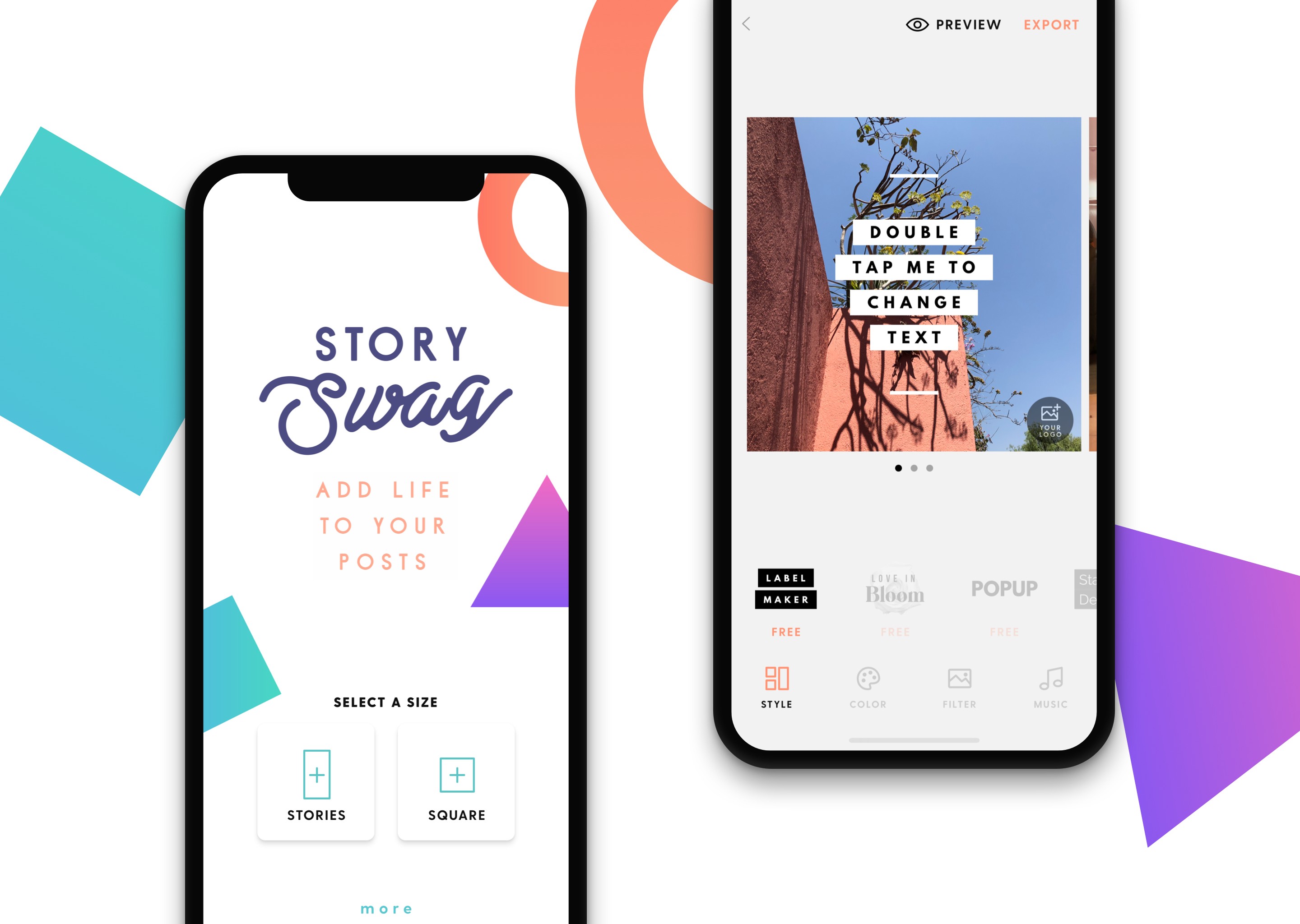
Story Swag is an iOS app that provides customizable animated templates for Instagram, TikTok, and other social platforms. The product operates on a freemium model, with watermark removal and custom logo uploads gated behind a Pro subscription.


I was responsible for improving the conversion experience around the custom logo feature, a primary monetization driver, while also designing animated templates and maintaining UX quality across the app.

02

PROBLEM

The Signal We Almost Missed

The Signal We Almost Missed

"I can't remove the watermark."

"I can't remove the watermark."

"Why does this keep popping up?"

"Why does this keep popping up?"

"Is this feature broken?"

"Is this feature broken?"

Individually, these seemed like small usability complaints. Collectively, they pointed to something more significant. When we reviewed the heatmaps, the watermark area consistently showed high interaction. Users were tapping it often. That behavior suggested intent. But the experience they encountered did not match their expectations. This was not just a usability issue. It was a conversion bottleneck.

Individually, these seemed like small usability complaints. Collectively, they pointed to something more significant. When we reviewed the heatmaps, the watermark area consistently showed high interaction. Users were tapping it often. That behavior suggested intent. But the experience they encountered did not match their expectations. This was not just a usability issue. It was a conversion bottleneck.

Framing the real problem

Framing the real problem

The watermark was functioning as a branding element, a monetization gate, and a high-intent interaction surface. But it didn't visually communicate any of that.

The watermark was functioning as a branding element, a monetization gate, and a high-intent interaction surface. But it didn't visually communicate any of that.

For free users, the watermark looked static but acted interactive. For Pro users, the logo modal triggered too easily and blocked content. In both cases, the interaction reduced trust at the exact moment users were signaling interest.

For free users, the watermark looked static but acted interactive. For Pro users, the logo modal triggered too easily and blocked content. In both cases, the interaction reduced trust at the exact moment users were signaling interest.

The question became: How might we transform this from a friction point into a confident upgrade moment?

The question became: How might we transform this from a friction point into a confident upgrade moment?

04

DESIGN

04-01

MAPPING THE SYSTEM

MAPPING THE SYSTEM

Before designing, I mapped every state connected to the logo interaction:

Free user editing a template

Free user preview and export

First-time Pro user uploading a logo

Returning Pro user editing or deleting a logo

Accidental tap scenarios

I identified edge cases where:

  • Users tapped out of curiosity

  • Users tapped intentionally to customize

  • Users accidentally triggered modals

  • Users needed visual confirmation before export

This clarified that the issue was not just a modal design problem. It was a system clarity problem.

04

FINAL DESIGN

Free Experience: Clarify Before Upselling

Free Experience: Clarify Before Upselling

Problem: Previously, tapping the watermark triggered a direct upsell.
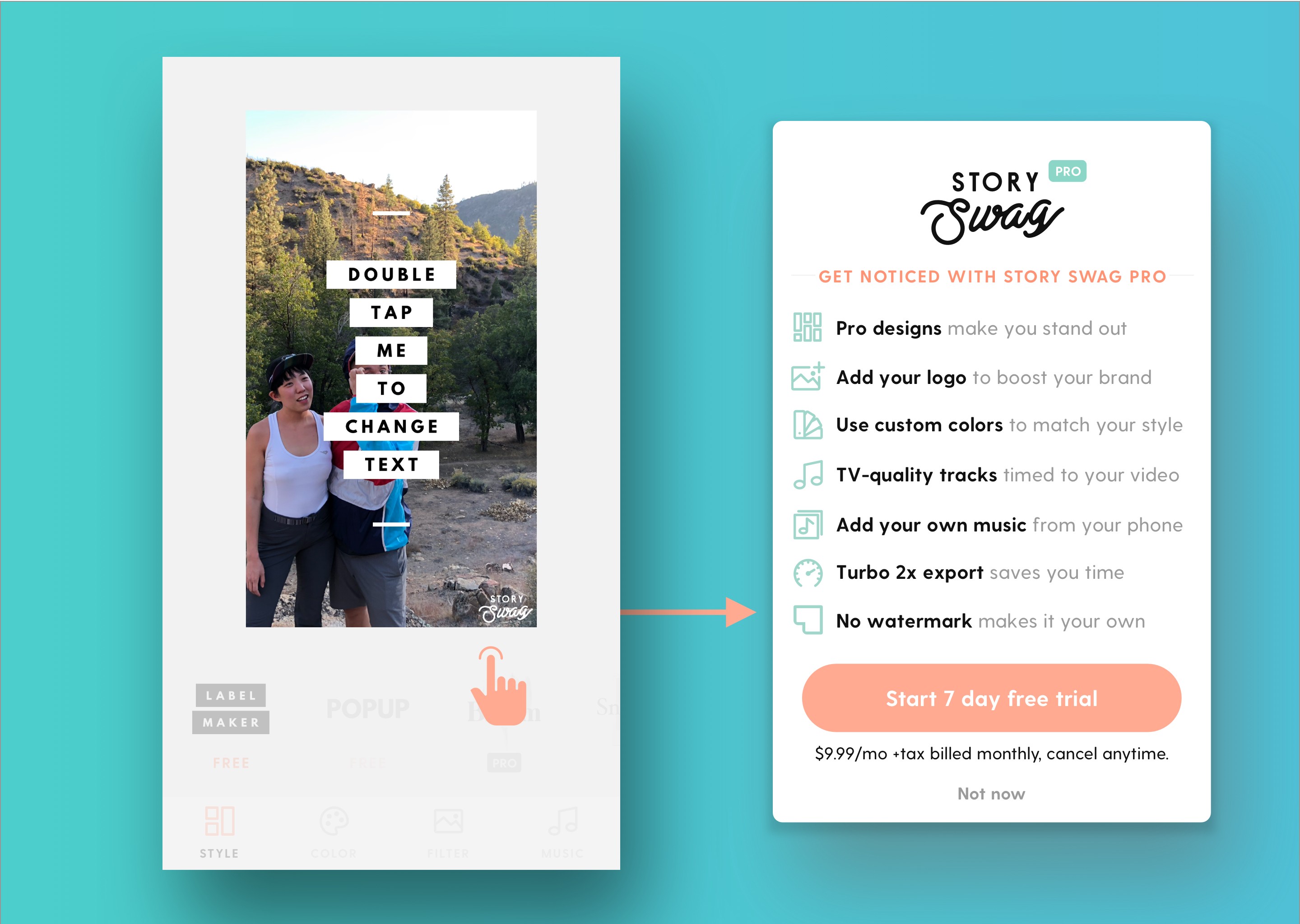
The Solution:

I replaced the static watermark with the same “Add Your Logo” icon used in Pro. This small visual change introduced affordance and consistency.


Then, instead of immediately launching the paywall, I inserted a lightweight educational modal explaining that logo customization is a Pro feature.

This created a moment of understanding before monetization.

The upgrade felt intentional rather than punitive.

Pro Experience: From Fragile to Intentional

Problem: For Pro users, the interaction had the opposite issue. The feature worked, but it lacked control.


The modal blocked part of the template, preventing users from confidently previewing their final design. Tapping anywhere triggered the logo editor, leading to accidental interruptions.
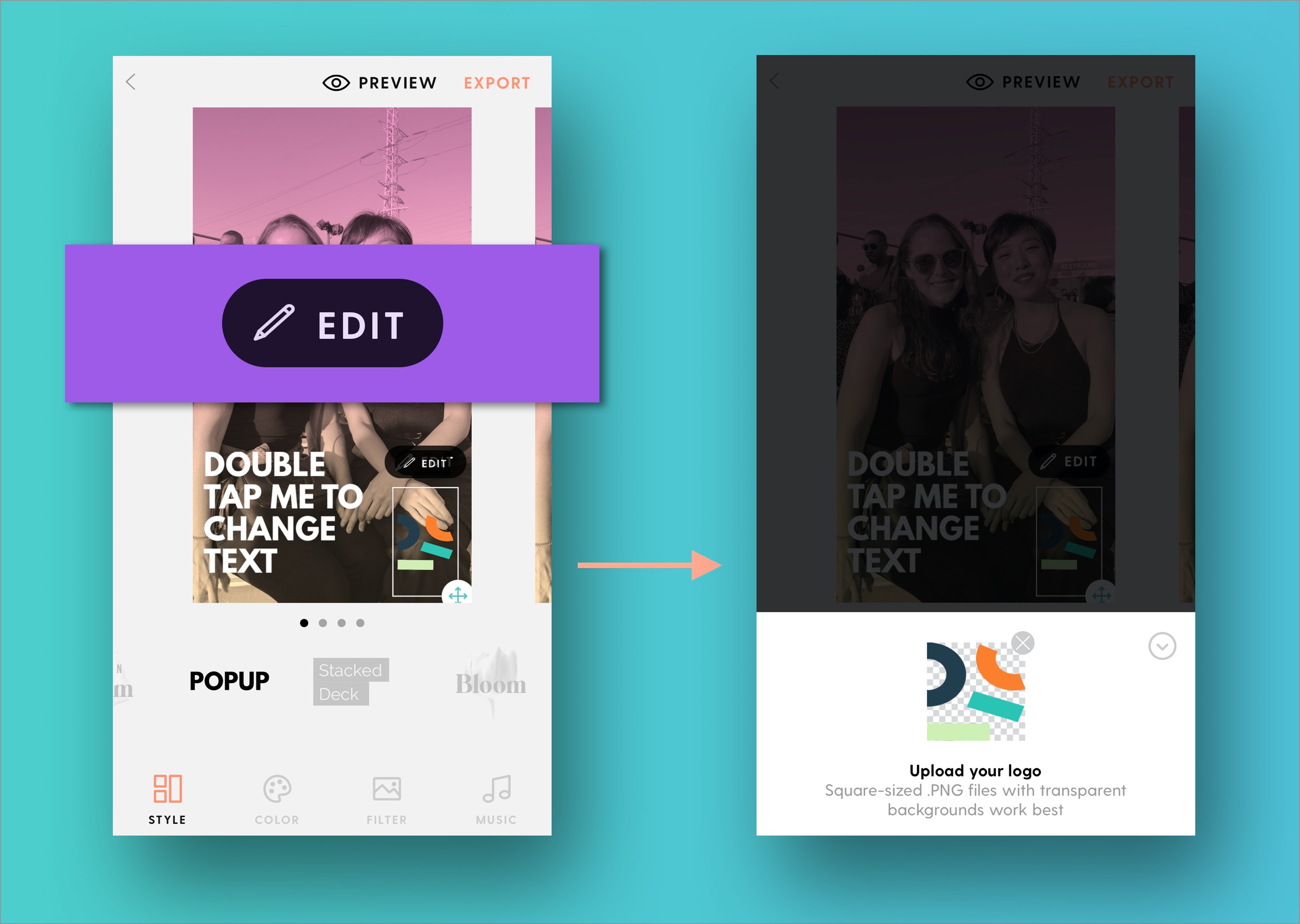
The Solution:
I resized and repositioned the modal and added a dark overlay to prevent accidental taps.


I introduced a clear "Edit" button to replace blanket activation.


These changes made the interaction deliberate. Users chose to edit rather than accidentally triggering it.

05

IMPACT

50% Trial Subscription increase

Trial starts increased by 50 percent

What This Demonstrates

  • High-impact opportunities often exist in overlooked micro-interactions

  • User frustration is frequently misdiagnosed as feature demand

  • Behavioral signals like heatmaps can reveal upgrade intent

  • Monetization works best when it feels aligned with user goals

  • Small UX improvements can produce meaningful business outcomes

INTERESTED IN CONNECTING?

Let’s talk ideas, collaborations, or your next big idea coming to life.

INTERESTED IN CONNECTING?

Let’s talk ideas, collaborations, or your next big idea coming to life.